
I consider myself a fairly good parent. I love my kids, and I tell them; I make sure they eat well (McDonald’s right? just kidding); we all get lots of exercise, and we all get lots of sleep (well, I don’t, but they do). I know their birthdays, and I know their friends.
But I’d have a hard time telling you how tall they are. It’s just not something I have in my memory.
Amusement park operators clearly know this, and so at the entrance of every ride they have signs like the one at the left. They don’t expect me to know how tall my kids are, and they don’t expect me to be able to compare that height against an abstract. I just plop them next to the stick.
Think of how else an amusement park could have done this — when I enter the park they could have, for example, given me a print-out of each ride with the height and weight requirements. But what would I do with it? It would be the same data, but pretty much useless.
This is an example of the difference between identical data that is usable (hey, my kid is too short) versus useless (what did I do with that sheet of paper?) simply because of differences in presentation. It matters how you present data, at least if you’re trying to get action out of it. And if you’re not, why present it?
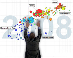
So two themes here, I guess: One, if you are presenting data, think about the recipient’s frame of mind and present it in a way that will create an impact; and two, if you are looking to learn more about the world, the challenges we face, and why your part matters, take a look at Gapminder.